Logo Color and Design Requirements for Maximum BIMI Effectiveness
To achieve maximum impact with BIMI (Brand Indicators for Message Identification), your logo must meet strict color and design standards. Learn how to optimize your logo for consistent inbox display and brand recognition.
Why Color and Design Matter for BIMI
BIMI enables brands to display their logos in supported email clients, but only if the logo meets strict technical and visual standards. Proper color and design choices ensure your logo appears crisp, recognizable, and professional across all devices and backgrounds.
Core BIMI Logo Design Requirements
- Vector Format: The logo must be a true vector graphic (SVG Tiny PS format), not a bitmap. This ensures scalability and clarity at any size.
- Square Dimensions: The logo must fit within a perfect square canvas. This allows for consistent display across email platforms, which may render logos as squares or circles.
- Centered Logo: Center your logo within the square. This prevents cropping or misalignment when displayed in circular or rounded-square containers.
- Solid Background Color: Use a solid, non-transparent background. Transparent backgrounds may not display as intended, especially in dark mode or non-white interfaces. Choose a background color that provides strong contrast with your logo for maximum visibility.
- File Size Limit: The SVG file must not exceed 32 KB to ensure compatibility and quick loading.
Color Best Practices for BIMI Logos
- Contrast is Key: Ensure your logo colors have strong contrast with the background for legibility in all inbox themes, including dark mode.
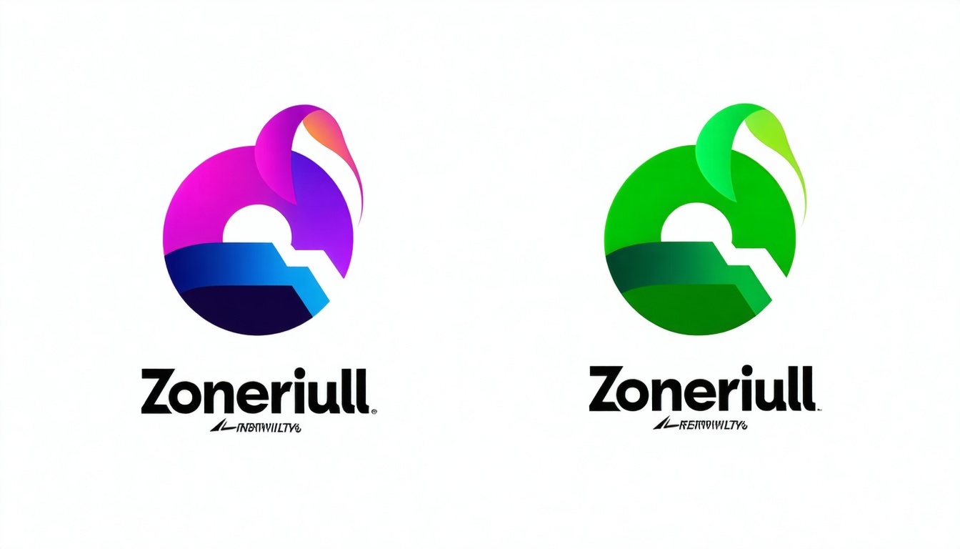
- Limit Color Palette: Use no more than three to four colors to maintain a clean and recognizable design. Avoid overly complex or colorful logos, as they can lose clarity at small sizes.
- Brand Consistency: Stick to your official brand colors, but test your logo for visibility on both light and dark backgrounds. Avoid gradients, shadows, or effects that may not render consistently across all email clients.
- Test in Monochrome: Make sure your logo remains recognizable when converted to black and white or grayscale, ensuring accessibility and versatility.
Common BIMI Logo Design Mistakes to Avoid
- Transparent Backgrounds: Avoid using transparent backgrounds; always apply a solid background color to ensure consistent display across all email clients.
- Small or Intricate Details: Fine or complex details may be lost at smaller sizes. Simplify your logo design for better clarity and visual impact.
- Excessive Colors or Fonts: Limit the number of colors and fonts to keep your logo clean and legible. Too many elements can make your logo appear cluttered and hard to read.
- Bitmap Images: Do not embed PNG, JPEG, or any other raster images in your SVG file. Use only pure vector elements to ensure full BIMI compliance.
Final Checklist for BIMI Logo Color and Design
| Requirement | Details |
| Vector format | SVG Tiny PS, no bitmap elements |
| Square, centered design | 1:1 aspect ratio, logo centered |
| Solid background color | No transparency; strong contrast |
| Limited color palette | 2-4 colors; avoid gradients/effects |
| File size | ≤ 32 KB |
| Brand consistency | Use official colors and test for visibility |
| Simplicity | Avoid intricate details and clutter |
Need help optimizing your logo for BIMI?
Contact our support agents for expert guidance on logo design, color choices, and BIMI compliance.
Find more answers in our VMC and BIMI FAQ section.
For maximum BIMI effectiveness, use a solid background, limit your color palette, and ensure your logo is a centered, vector-based design that stands out in any inbox.